Showing posts with label Palette. Show all posts

Friday, November 13, 2009

Muted butterflies...

This card is a CASE of these beautiful cards so please go give them some much deserved love -

http://www.splitcoaststampers.com/gallery/photo/1226299

and

http://www.splitcoaststampers.com/gallery/photo/1311815

and

http://www.splitcoaststampers.com/gallery/photo/1273358

I loved the rainbow of the first, the vibrancy of the second and the flow of the butterflies of the third.
When I set out to do this card I knew that I had to use Neenah for the base to give that crisp white flair. I then decided to have the duller colors of my paper choices at the bottom to give a lift to the flow of the butterflies. I used the single butterfly punch and the triple butterfly punch from Martha Steward on the K&Co paper. Instead of giving the butterflies black bodies I wanted to keep it light and airy so when with clear stardust glitter pen.

I hope you like my interpretation of a theme that has already been done brilliant by some really talented ladies.

Ingredients
Card Size - 8.5in x 5.5in
Cardstock - Neenah
Stamps - Kitchen Sink Stamps
Ink - Palette noir
Designer Paper - K & Co
Punches - Martha Stewart
Pens - Sakura Stardust clear


Monday, November 9, 2009

Hipp O'Birthday!

I love this image I got from High Hopes! I never thought of myself as cutesy but I guess I am. I tend toward young images rather than overt realism. I guess I like the fun fantasy of them and the kick toward being young at heart. I do love the effects I get with my copics in coloring in our purple hippo. I decided to take a nod from the High Hopes Stamps though made my hippo more purple than theirs. Theirs has more pink tones but I shyed away from the pink tones as this is for a boy.


I also like the color combo of orange and blue and wanted to use up some of my patterned cardstock stash - so pretty but I struggle to use it!

With my critical eye I think there are two things I could have changed about this to just make it pop that much more. Use a co-ordinating green in the image itself and vary the grounding color from the shadow.

Ingredients
Card Size
- 5.5 in x 8.5 in
Cardstock - Neenah, Bazzill, DCWV
Stamps - High Hopes Stamps, Stampendous
Ink - Palette Noir
Color - Copics - BV00, BV02, BV04, BV06, BV08, YR02, YR04, YR07, B000, B00, B02, B05, R27, R29

Tuesday, October 27, 2009

Bugging a Tomboy birthday!

I think this has to be my favorite card I have made recently.
There were several things I wanted to accomplish when I made this card. I wanted the image to be of a not so girlie girl and for you to get the impression that although there is a bow in her hair and a flower in her pocket that the bow is there because her mother put it in and she is far too engrossed in tomboyish pursuits and discovery to worry about it.

Secondly I wanted to use a quirky color combo that was actually inspired by some early Halloween cards that I had seen (take that hot pink and make it purple and I think you will see what I'm talking about).


I chose my colors of cardstock first before I started to color my image, so that my color choices would compliment the image. After I colored in the little girl in Copics I decided that my glass jar would look a bit green around the edges I had already decided the bugs would have a glow about them when I colored her face in so I just went for the yellow glow. Of course because the girl isn't too girly the bugs and flower had to be sparkly so they got clear Sakura stardust on them and then what you really can't see in the pictures is that the glass jar was cover in glossy accents.

The patch on her knee reminded me of my heart Nestabilities and I looked at them and decided I wanted the sentiment to be subtle so I embossed the heart with my cuttlebug folder before cutting it. You can just see in the main photo how the ribbon goes through the heart and I debated ages about adding the brad and finally decided to do it. What do you think?

For the inside of the card I decided to use the negative of the scalloped heart as a mask to pounce the inside with color and stamp the sentiment over.

Ingredients
Card size - 5.5in x 8.5in
Cardstock - Neenah, DCWV, Michaels
Stamps - High Hopes, Kitchen Sink Stamps
Ink - Palette noir, Memento Rose bud, Memento Tangelo
Copics - E00, E02, E93, G000, 05, Y00, YR00, YR02,YR04, YR07, V15, V17, RV02, RV04, E33, E35, E37, C1, C3, C5, C7, B000, B00.
Accessories - grosgrain ribbon, brad, Nestabilities, Cuttlebug embossing folder, cropadile, Sakura stardust clear.

Thursday, October 22, 2009

I've got the Moo-sic in me! What Party a Animal.

I love this cow stamp from High Hopes! It's downright moo-ving, and makes me feel so moo-sical! It is absolutely udder-ly fun! The punny thing is that this card started with the candles!

For some reason I had Sixteen Candles in my head for my niece's 16th Birthday - well I think we can all agree I put a few more than sixteen on here but the stamp just made such fun and unique background paper.

I also used the cake from the same Stampendous set so our cow would have a purpose other than to party her life away!

My cow likes to party all the time, party all the time, party all the time...oh dear went a bit 80's retro there for a moment! However I made certain she was ready to impress, her cake candles have stickles and her hoofs are polished (glossy accents) and what silly card worth its milk doesn't use googly eyes when the opportunity presents itself?!?!?!

I cut out our party cow and cake and then had to think... what would pop with the colors I had already selected. I decided that pink and green color combo doesn't get the love it once did (and having a massive mound of green cardstock staring at me as well probably didn't hurt).

Now to decide on the layout... well I never said my process was straight forward. I had already decided to have a more upright card by the placement of the candles, thought they might look a bit odd on their sides LOL. So I trimmed up my artwork GASP! HORROR!! to make it fit the front of my card and started mounting everything... now the guilt trip over the little slip of tenderly stamps and colored background - my aha moment was to mount it and use it to decorate the inside of the card which you can just see with the photo.

Hope you like it! and thanks for all the support.

INGREDIENTS
Card size - 8.5 x 5.5 inches
Cardstock - The Paper Source, Neenah, Georgia Pacific

Stamps - High Hopes Party Cow; Stampendous Fifteen Candles;
Ink - Palette Noir
Copics -
Cow - 0, W3, W5, W7, C5, C7, E50, E51, R00, R20
Cake - 0, RV000, RV02, RV04, RV06, R00, Y02, Y06, Y08, C3
Background - RV02, RV04, Y02
Accessories - Stickles, Glossy Accents, googly eyes

Tuesday, October 20, 2009

It's all about Zoe! and learning how to alter the collection I have amassed!

This is a whole gift set that I made to send to my neice for her 16th Birthday. I thought it turned out pretty cute. I got this We R Memorykeepers paper pack with purchase at Archivers and thought it was quite funky and youthful (which probably means it isn't - LOL). I know there is nothing "new" here to rock the blogging world but just a bit of sharing. I went to cover the letters and they are taller than my 6x6 paper so I thought I would embellish with ribbon at each end and in the middle of the "o". The ribbon "blossom" I have seen everywhere but didn't bother reading any instructions I just threaded ribbon folded on an angle on thread and tied it off and that is what I got. I went through my brad stash and liked how the brad echo'ed the dots in the paper and added a bit more whimsy. Then added some clear Michaels "dew drops" for a little bit of bling and edged each letter with white grosgrain ribbon to finish the edges, which was probably the most difficult part.

On to the next part of the gift - notecards! I liked mixing it up with the paper selection and the DCWV cards I had picked up in one of the Michael's sales ages ago. With my Nestabilies, my Palette ink pad and my JustRite Stampers I think they came out pretty cute. So just bear with my proud mamma moment...
And then there is this one! I think I frugally love it the best because I just used the ends that I cut off from all of the cards above to make it!

Then I was stumped! Yikes - I need to package these. How about a cute ribbon. No. That didn't work. It looked sloppy and it might come undone on its trans-Atlantic journey. What can I do? I will have to make a box of some sort. So I got out my Scor-pal and played.


oh wait!
There is something more!

I can't fool you - you saw them above didn't you?

I had to throw in some beaded pens. This time I put the patterned paper inside the pens and covered the pens with microbeads and then sealed them with Glossy Accents. I forgot to tell her the pens are refillable so I will have to let her know and that she can put other patterned paper in them because of how I did them.
Then I just had to have a go at a mini mailbox - perfect to send a few post-it notes

I would have loved to put some stamps in the mail box but she is overseas so that wouldn't really work. I also added loads of fun school supplies. She is planning on training to be a Nursery school/Pre-school teacher so I hope all the little fun supplies will come in handy with her school work or just be whimsical play for her.

I think these are the first set of alterables I have done so I'm pretty pleased with them - hope you like.

And thanks for the previous comments - I do my blog to keep my friends (past, present and future) up to date with my hobby, but its always nice when someone likes something and tells me! I really need to make more effort to leave some blog love!

Hopefully the ingredient list for this is pretty straightforward so I won't bother with this post.

Thursday, June 18, 2009

A Lovely Anniversary

I honestly don't know "why" I wanted to use this image for this couple as they live on the outskirts of a large city and have never lived in the country. I guess my mind works in mysterious ways LOL!

I think the true inspiration for this card was actually on High Hopes website for use of the release but I had to go to the maker's site to find it again! http://6wackywomen.blogspot.com/2009/03/down-on-farm.html How gorgeous is that card! I just wish I had read her blog entry about time consuming before I attempted mine! LOL - I know mine isn't even a patch on the original but that was my inspiration. I did think about doing a stair step card, however as this was going in the international postal system I thought it would probably make it too uneven for the journey. Because I put a little bitty bow on it I already had to put bubble wrap on it! - so I hope it gets to its destination relatively undestroyed.


Ingredients
  • Card size - 8.5in x 5.5 in
  • Cardstock - base and mat HobbyLobby textured; Neenah Solar White; Georgia Pacific
  • Stamps - High Hopes Stamps; Clear Dollar Stamps (crayon alphabet also used for internal greeting)
  • Ink - Palette noir; Memento Lady bug, Rose bud ; Copic multiliner black
  • Color - Copics (0, B00, B12, B93, B95, B97, C-1, C-3, C-5, E00, E02, E29, E31, E33, E35, E37, G000, G17, G21, G28, G85, G94, G99, R22, R27, R29, RV000, RV02, RV21, RV28, Y11, Y15, Y17, Y21, Y28)

Monday, June 15, 2009

Erin's Baby Shower decorations, "cake" and card

I have had loads of fun recently with a baby shower my aunts were hosting. One of my aunts said that they had divided up the jobs and she was doing food and decorations - I said "well, for goodness sake don't buy anything without checking with me because I have loads of paper/cardstock and I have a Cricut so I can probably make something more personal than what you can buy. So she just left me to it. The directions were it had to be "pink"!!!! Cue big smilie face and the cobwebs being blown off my creative brain!!!

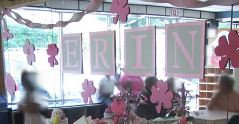
My biggest concern with the space is that we had a wall of mirrors to contend with. I don't know about you but most people I know don't like to look at themselves THAT much so I cut decorations to cover the mirrors! The pink shamrocks are because Daddy is very proud of his Irish heritage so it just had to be done with a bit of creative license. Personally though I am really happy with "thinking" about doing baby blocks for the name - I haven't seen it done before though I'm sure I'm not the first.

Ingredients - decorations

  • 2 packs of 11 x8.5 cardstock from Michaels collection - I wanted 12x12 but they didn't have it in the colors I needed.
  • Hobby Lobby textures white cardstock for blocks
  • Pearlescent Wassau cardstock for blocks
  • Cartridges - Home Decor, Plantin Schoolbook and PaperDolls

I also had to think about my card and present.

I decided to do a diaper cake from watching several tutorials on YouTube but changed things up a bit - I love this tutorial because it uses clothes pins to hold the diapers together and rolled so I didn't have to go source a lot of rubber bands and after you got the hang of it, it was pretty simple to put together this is the video I used for my main source of inspiration http://www.youtube.com/watch?v=vfwaaNjxUhY . I also only used a pack of 48 diapers as I had purchased a receiving blanket 4 pack off the mother's baby list and used one for the inside of the base and then the rest around the outside. Then I thought what is a Baby Girl Cake without loads of roses so I put loads of little sock roses all over the cake too! and then added a some teething rings, rattle, bath toy and the top layer is a onesie I printed with my Cricut using these instructions http://cleversomeday.wordpress.com/2009/04/25/freezer-paper-shirt-video/

Ingredients - cake

  • 48 size 2 Huggies diapers
  • 4 receiving blankets
  • 6 diaper pins
  • 8 pairs of girl socks individually made into "roses"
  • Ribbon from Michaels
  • Teething ring
  • Bath "duck" that measures water temperature
  • baby rattle that attaches to stroller/carseat

Now for the main purpose - my card!

I really bought this High Hopes stamp to use for Baby Showers because I like to have multi-function stamps. So I just had to use it and as it turn out one of the shower games was animals and what their babies are called - at least I got the Kangaroo one right!


The inside reads "can't wait to meet your Bouncing Baby Girl"

Ingredients - card

  • DCWV - prescored card and envelope, cardstock for mat
  • Neenah Solar White for stamping
  • High Hopes stamp
  • Memento rose bud ink, Palette Noir
  • Copics - didn't get the numbers sorry folks but I will say I am thinking they were E29, E31, E33, E35, E37 and RV00, RV21, RV23 though I really that is really a guess from what I put away yesterday!
  • Nestabilities - rectangles and scallop rectangles
  • Small brad "buttons"

I have a few more projects I'm just getting done but wanted to share this one. Hope you like!

Wednesday, May 13, 2009

British Invasion in a card!

I made this card for the Inkafriends gallery. I just had this image of using this stamp set to express my love of British Music from the Beatles, Rolling Stones, Queen, Led Zepplin, Sparks, Duran Duran, Wham, Depeche Mode, Wet Wet Wet, Eurythmics, Pet Shop Boys, the Stone Roses, Happy Mondays, Blur, Oasis, Stereophonics, Robbie Williams, Radiohead, Gorillaz, Muse, Kaiser Chiefs, Franz Ferdinand, Kasabian, and you will probably even find me singing along with the Ting Tings.

Well you get the idea LOL.

The card itself is a single layer with masking. First, I stamped the guitars and the "You Rock!" and colored with Copics. The next step was to create two guitar masks, one "You Rock!" mask and two long strips of paper masks to help make the Union Flag reference. I stamped the light blue winged skull images first and I eye-balled the placement. Then I stamped the darker blue stars to layer the look even more. Next it was time to take off the strips of paper masks and stamp the border to create the red lines.

I really enjoyed making this card and hope you like it and it inspires you to do something musical with your stamps!

Ingredients
  • Card Size - 5.5 in x 8.5 in
  • Stamps - Inkadinkado
  • Inks - Palette, Memento
  • Color - Copic markers
  • Cardstock - Georgia Pacific, Archiver's

Friday, May 8, 2009

You Quack me up Birthday Girl!

We got the invite to the party in the late morning for a party that evening so I had to think/create/panic/think quick. If you know me, then you know that isn't my usual style at all. I think it came together ok, though I wish I could have just found some solid cardstock in the blue. I didn't want to run the risk of the blue on the orange looking horrible as I didn't have time for a "re-do" and wanted it to look fresh rather than distressed.

All the stamps are Clear Dollar Stamps. I just had a play with some of the images that were speaking to me and I thought I could put together quickly.

Hope you like.

Ingredients

  • Size - 5.5 in x 8.5 in
  • Stamps - Clear Dollar Stamps
  • Ink - Memento, Palette (black)
  • Color - Copics
  • Cardstock- Neenah Classic Crest Solar White, Georgia Pacific, Bazzill
  • Ribbon - Michael's

Saturday, April 25, 2009

Jumping or rather smashing Jukeboxes....

I made this card for a dear friend in England who enables the collecting of jukeboxes. I think at last count she told me they had three!!

When I think of jukeboxes, besides of her, I think of the 1950's so that was cue I took for my color scheme. I colored in my VivaLasVegastamps jukebox with copics in blues, reds and greys and and then put glossy accents on it and left it to dry. When I got back to it, it was bowed so I thought VOILA! I would put it through my cuttlebug to flatten it a bit...I really should have taken a before and after picture of that LOL, because the blob that came out the other end of the cuttlebug bore no resemblence to the lovely jukebox I had colored in. So I started again with my VivaLasVegastamps jukebox and colored it in with blues and reds and greys, though not too many greys as I wanted it to be cheerful, not depressing! then I clear embossed to get a shiny image staying well away from the mind bending experience of the glossy accents! LOL

I then thought whats a jukebox without some sparkle so I found out some of my holographic cardstock and cut it down and ran it through the cuttlebug with the Allegro folder (don't worry its even difficult to see in real life) and used my musical notes dies with black cardstock. I then used Nestabilities to cut out the apetures on the black and pink cardstock and ran the pink cardstock through the Cuttlebug with the Swiss dots embossing folder (twice to get the whole thing) and decide to run the paper through once on its own to knock back the dots so it looked more "retro". The frame and jukebox are 3D'd off the cardstock base.

On the inside I used a Martha Stewart punch to give a checkerboard effect to put the greeting on. and then did a white layer using the negative of the double note die and stencil through for a background for the sentiment.

Critical eye - I think I should have carried over the blue from the jukebox with the frame more and with a thin blue layer frame. I also think maybe I should have found a way to make those swiss dots black (I'm not great at brayering and wanted a very neat look) before I mashed them back down

Ingredients

  • Card size - 5.5 x 8.5
  • Cardstock - Bazzill, Hobby Lobby, Holographic unknown, Georgia Pacific
  • Ink - Palette
  • Color - Copics
  • Embossing folders - Allegro, Swiss dots

Friday, April 24, 2009

Wooly thanks....

I have posted this card in my gallery on SCS from a quick scan. However I thought I would come to my blog and do it properly.

The image stamps are from
Clear Dollar Stamps and when I got the little sheep with my last order I just knew that these two sets had to be combined! Maybe it was living in England all those years and seeing sheep in the field with random markings. I don't know but I think it is one of those kinda funny things maybe its punny. I keep thinking, is this what they mean by "pre-dyed" wool?

The sheep stamp is a single (as you can just get a glimpse of inside the card) so I had to make about four masks of her to get this effect.

I do like the mottled effect of the sentiment though I know some people wouldn't. It reminds me a bit of the texture of knitting.

Critical eye - I think if I did this card again I would spell "wooly" as "woolly" - I looked it up and both are correct but the double "ll" is more correct. Also I would have the bottom of the feet of the sheep on the same level as the bottom of the basket. I would have put an insert in the card for the little grey sheep to be on - because as we know copic colors bleed through.

Copic lowdown - I know I don't have a list of Copic colors for this one as I actually made it before the fairy card. What I do remember is that the colors are pretty low numbers 00's, 10's and 20's for the most part, and the basket is mostly numbers in E 30's.

Ingredients
  • Cardsize - 4.25 x 5.5 in
  • Stamps - Clear Dollar Stamps, JustRiteStampers
  • Cardstock - DCWV premade base card, Georgia pacific, Hobby Lobby black c/s
  • Ink - Palette
  • Color - Copics
  • Tools - Nestabilities
  • Techniques - Stamping, Masking

Monday, April 20, 2009

Fairy belated... Edited to add list of copics used

Well you know I told you about my trip to Nomojoland, which is a very scary place to be indeed. Well this was another friend who suffered not being remembered on her special day because of the scary monsters in Nomojoland.

Well this cardie friend loves rather funky fairies so when I saw the new(ish) Fairy stamps from Inkadinkado I knew that I had to buy them and do a card for her with them.

I colored the fairy first with my Copics. Then with my Sakura clear stardust pen over her wings. I don't know what it is with fairies but I nearly always tend toward purples, blues, greens and pinks for them - so I think I might need to do this image again a few times and ban myself from those colors! (can you just see the subtle sparkle on the wings? --------->>>>)


I decided that as she is flying I would just "pop" her away from the background with a little shading and I wanted the added contrast of the white around all that color in the image so she really stood out on the card.

The circles were inspired from the K&Co paper that I have had for about five years. The butterfly is from the same stamp set and the greeting is from a Brenda Walton Inkadinkado set.

I did use a new tool on this card which is the Martha Stewart Circle Cutter - I like it because of the variety of circle sizes you can get with one tool and cutter. There is a bit of a learning curve with it however, what I did in the end to keep the paper from slipping was just tack it down to the cutting mat in a few places with temporary glue stick - worked like a charm!

Ingredients

  • Card size - 8.5in x 5.5in
  • Stamps - Inkadinkado
  • Ink - Palette
  • Cardstock - Georgia Pacific, K&Co, Bazzill
  • Color - Copics, Sakura clear stardust pen
  • Tools - Martha Stewart circle cutter

Copics Used

  • 0
  • Skin - E00, E02
  • Hair - E31, E33, E35, E37, E47
  • Dress, shoes, wings - V000, V04, V06, B00, B23, B24
  • Flower and dots on wings - RV02, RV04, RV06
  • Wand - Y00, Y02, Y06, Y08
  • Shadowing - C1, C3

Sunday, April 19, 2009

Subtle inspiration....

I belong to a very special group of ladies and this was a belated (read embarrassingly very belated) birthday card for one that LOVES frogs... so frogs were the theme... I think it is rather subtle, don't you? LOL

This is kinda how my thought process went with this card - hope you enjoy -

So I started with Frogs. Frogs are green and in my mind bumpy, now you toad enthusiasts don't get all technical on me! Oh I have just the stamps set from Clear Dollar Stamps and that sticker from Imaginisce I bought just for this card... but what safe place did I put them in?. Hmmmm.... now I need to decide on colour combos... oh the toadstool would be red... um no... her birthday is next to Christmas, no green and red together (remember I told you this was v.v.belated) - oh Pink that's nearly red but not so the toadstool will pass... and White will keep things crips and fresh... I want to use my threading water punch... oh and my swiss dots folder... oh, why don't I just have a secondary theme about the bumps I mean circles yes circles ;)

And yes when I'm in the "zone" that is pretty much what my internal conversations are like though I think I left out a squee or two.

As it was so late I thought it would be a bit "naff" to put a greeting on it.

On the mojo loss bit, I had never lost my mojo like that before. I really didn't want to look at anything creative at all and its a quite scary place to be. I don't want to go back to nomojoland anytime soon that is for certain.

Ingredients

  • Card size 8.5 in x 5.5 in
  • Cardstock - Bazzill, Georgia pacific, Michaels
  • Stamps - Clear Dollar Stamps
  • Ink - Palette
  • Color - Copics
  • Sticker - Imaginisce
  • Tools - Threading Water Punch, Nestabilities, Cuttlebug Swiss Dots folder.

Monday, April 13, 2009

I really love those tiger feet...

I guess I can go old school on my singing - That's neat,that's neat, that's neat, that's neat I really love your tiger feet... Glam rock at its best - gotta love a bit of Mud LOL! Come on and dance along, you know you want to!
This is another card I posted in my SCS gallery. Its about my third or forth attempt with my Copics. All the inspiration for this card is my son's High School - colors and mascot.

Looking back at the image I can see things that I would change but I am generally happy with a good percentage of the coloring and the layout is fine - there is only so much you can do for non-frilly boy cards!

I love the High Hopes Tiger image and bought it specifically to use over and over and over again over the next few years! This card really is a hodge podge of brands so here we go and I hope you like it -

Ingredients

  • card size - 5.5in x 8.5 in
  • stamps - High Hopes Stamps; Kitchen Sink Stamps
  • paper - Georgia Pacific, Bazzill, Michael's value pack, Hobby Lobby black textured.
  • Color - Copics (low & middle E numbers and warm neutrals from the Ciaos - yes I have all the Ciaos where is that embarrassed smilie - but I do love them!)
  • Ink - palette, versachalk (highlighting the embossing)
  • Embossing folder - Provocraft

Friday, April 10, 2009

Let it Rock, let it rock, let it rock...

Because when I'm alive, I can feel the fire. Make you come alive...

oh wait...

this is supposed to be a card blog, not a group sing-a-long! LOL! Someone out there in bloggieland knows what I mean and yes Treacle, darling, we are in the Naughties not the 80's. ;)
Another card I did for my son's birthday. I took him to his first concert, Live8 in Hyde Park 2005. We are still deciding if we need to do another gig soon, Franz Ferdinand is pretty near and then there are rumors that Kaiser Chiefs are supporting Green Day, ah but I digress again. I scanned the card so you can't really tell from the picture that the guitar is popped up.

Hope you like because I know people struggle with "guy" cards.

Ingredients

  • Card size - 5.5 in x 8.5 in
  • Cardstock - Georgia Pacific, Bazzill, DCWV Rockstar
  • Stamps - Inkadinkado
  • Ink - Palette, Memento, Brilliance
  • Color - Copics

Oh Boy - Card for an Egg Head

I'm truly blessed to be the mother of an incredibly bright young man, but don't tell him I told you so. He is currently working hard at maintaining his straight A's and is on the school's Academic Team as well.
So when I came across this VivaLasVegastamps image, I just had to use it for him! I hope he continues to try hard and accomplishes his dreams.

BTW the saying is JustRitestampers and it says "Massively" a bit of a play on the E=mc2 equation. Hope you like.

Ingredients
  • Card size - 5.5 in x 8.5in
  • Stamps - VivaLasVegastamps
  • Cardstock - DCWV, Georgia Pacific, Hobby Lobby
  • Ink - Palette
  • Color - copics

Wednesday, October 1, 2008

Popping Up to say...

I loved this stamp set the moment I saw it on Clear Dollar Stamps site - it's just so Squirrely! We always have to do the "Carling Ad" music when we see a squirrel - which seems to be quite often. As I don't know if this ad ever showed in the USA I'm sure people probably think we are quite mad (in the British sense of the word!).

As for the card, I did have to extend the tree trunk a bit. Its all colored in with my new favorite markers from Copic! including the background. The "SON" is from my new JustRite Stamps - they are so fantastically easy to use I don't have to worry about anything lining up all the work has been done for me!

Ingredients:
Cardstock - Georgia Pacific, Bazzill
Ink - Palette
Markers - Copic
Stamps - Clear Dollar Stamps, JustRite Stampers
Accessories - glossy accents (on the squirrel to give him a bit of dimension)
card size 5inches square.

Monday, September 8, 2008

Where O' Where has the time gone! my Copic 1st.

Yikes! I keep intending to post but end of summer festivities have gotten the best of me! Hope everyone is doing well, and those with kiddies have gotten them back off to school safely now.

I wanted to share this card - it is my first card with Copic markers. I love those markers they are so easy to work with and blend. And isn't this just about the cutest Elephant stamp ever!
This is also a card where I used every gray Copic in that group that I own! I know alot of people don't know when they will use the grays but I just wanted to give an example for everyone. I know I'm not the world's greatest colorer, but I think their are a lot of people out there that underestimate the usefulness of grays.

I then picked out a nice pink for the bow... well once I got it down on the cardstock my my my it was bright!... So out came my grays again!

Ingredients
Rubber Stamps - High Hopes
Ink - Palette; Copics
Cardstock - Georgia Pacific; DCWV
Other - Nestabilities circle and scallops; ribbon from Michael's.