 The catapult was then worked on by both them and they found a bit of tubing and proper density elastic to make it work. Of course, no self respecting boy would leave his catapult lying around without ensuring it could work. There in lies the story of my husband deciding the best thing to aim at was the neighbour's telly aerial. He had had a few goes and missed, that was until his father came out to see what he was up to. He told his father right away he was aiming at the neighbour's aerial and took another shot. Well as luck would have it he hit and in the same breath his father confiscated his catapult never to be seen again until they were clearing out the garage a couple of years later.
Sunday, February 28, 2010
A boy and his catapult/slingshot - for UK Mothering Sunday
 The catapult was then worked on by both them and they found a bit of tubing and proper density elastic to make it work. Of course, no self respecting boy would leave his catapult lying around without ensuring it could work. There in lies the story of my husband deciding the best thing to aim at was the neighbour's telly aerial. He had had a few goes and missed, that was until his father came out to see what he was up to. He told his father right away he was aiming at the neighbour's aerial and took another shot. Well as luck would have it he hit and in the same breath his father confiscated his catapult never to be seen again until they were clearing out the garage a couple of years later.
Wednesday, February 24, 2010
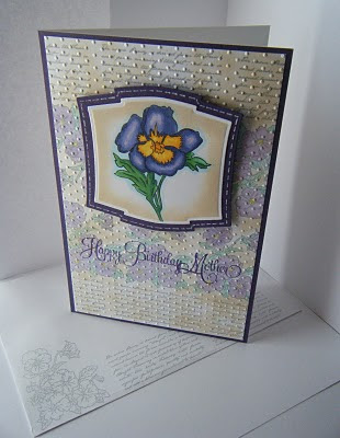
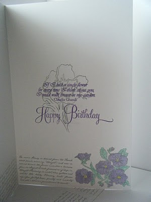
Purple Pansy Petal Power!


Sunday, February 21, 2010
Owl thank you!
 I love this cuttlebug folder - its not new but its such a great way to get a sentiment on a card without it taking over the image. I just embossed the front and then adhered it to the card base and edged the front in a purple ink that matched the mount for the owl image.
 Card Size - 4.25 in x 5.5 in
Monday, February 8, 2010
A 2010 card! but only on the scanner

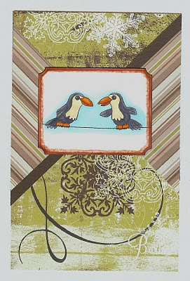
I covered the entire front in S.E.I. designer paper Alpine Forest (the white around the card is the scanner lid). The image is from Clear Dollar Stamps. I used it for my BIL because it reminded me of the birds that advertise Guiness which is just perfect for my BIL. I chose the cardstock to reflect that history and earthiness of the thick stout. After deciding on a layout I thought I should emboss a greeting but I wanted it unobstrusive, so I decided to use my Kitchen Sink set and Zig white embossing powder so that the "Brother" was there but not glaringly so.
I think the card is a little quirky with the mix of earthiness and cute birds but I think I like it because of that; I could have bought a card that was either or but this combination is truly unique because it is handmade. What do you think? Did I take it too far? Not far enough?
Ingredients
Card size - 8.5 in x 5.5 in
Cardstock/Paper - Neenah, S.E.I.
Ink - Memento, Versamark
Stamps - Clear Dollar Stamps "Hanging Out" , Kitchen Sink Stamps "Whole Family"
Copics - 0, B000, B00, C3, C5, C7, E50, E51, E08, E49, R35, R37, YR02, YR04, YR07,
Sunday, February 7, 2010
Hello friend!
 Oh dear...
I think I said I had already posted ALL my 2009 cards... well you can understand that I meant my 2009 Christmas cards right?LOL
This is a card I made for a dear friend whose birthday is at Christmas time and I like to send her birthday cards that don't look like Christmas cards with "Happy Birthday" on them.
I really like how simple this was and how it turned out.
 Loads of rectangles to compliment one another and a great patterned cardstock from DCWV. I cut apart a Stampendous phrase to keep it short and relevant, and guess what! no stamp police came and hunted me down for doing that! LOL.
Ingredients
Card size - 8.5 in x 5.5 in
Cardstock - Neenah, DCWV
Stamps - High Hopes Stamps, Stampendous (greeting)
Ink - Memento Tuxedo Black, Canteloupe
Copics - B000, B00, B93, B95, B97, E00, E02, E11, E31,E33,E35, G000, G00, G02, G05, G07, G14, G21, G28, R20, Y11, Y15, Y17, YR02, YR04, YR07
Saturday, February 6, 2010
2009 Christmas nephew
 Drum roll please! this is the last card from 2009! So what do you think? I sent it to our nephew. I managed to continue to use up some of my designer paper stash too!
Ingredients
Card size - 8.5 in x 5.5 in
Cardstock/Paper - Neenah, Archiver's open stock, Provocraft Rob & Bob stack
Stamp - High Hopes
Ink - Memento
Color - Copics - 0, E00, E02, R20, R22, R27, R29, C1, C3, W1, Booo, American Craft white gel pen
Embellishments - Liquid Applique, Nestabilities
Friday, February 5, 2010
2009 Christmas neice

I made this Christmas card for my neice she isn't that young (16) but I thought she would like the funky whimsy of the combinations. I think this is my favorite because I really like these stamps despite all the issues people have had with High Hopes. Its part of my trying to use what I have already series!
Ingredients
Card size - 8.5 in x 5.5 in
Cardstock/Paper - Neenah, Archiver's open stock, Provocraft Rob & Bob stack
Stamp - High Hopes
Ink - Memento
Color - Copics - 0, E00, E02, R20, R22, R27, R29, C1, C3, C5, C7, W1, W3, G14, G17, B000, B00
Spica red and gold
Embellishments - Liquid Applique
Thursday, February 4, 2010
Christmas 2009 - BIL & SIL

This card was for my BIL and SIL. I think it may be my favorite of the two individual cards I sent. I used my large cuttlebug holly embossing folder and then just colored over the raised holly with my copics and red spica pen. I colored the ribbon to match with the same pens and the "drops" are clear floral pebbles from Michael's that I color the back to match.
Wednesday, February 3, 2010
Christmas 2009 for the MIL
 This is pretty much all Martha Stewart punches glued on to look like a full spruce. I got my inspiration on Splitcoast Stampers - I don't know who was first but there were many cards. The ornaments are all jewelled brads and the sentiment is one of my favorites from Kitchen Sink Stamps embossed with white embossing powder.
So how would you have made this card better? I like the red,white and green traditional color scheme but did I take it too far.
Maybe I should have just put the tree directly on the red... hmmm....
Ingredients
Card size - 8.5 in x 5.5 in
Cardstock - Neenah, Archiver's open stock, Michael's Recollections
Punch - Martha Stewart
Stamps - Kitchen Sink Stamps
Ink - Versamark with Zig embossing powder
Tuesday, February 2, 2010
Christmas 2009
 We are over a month into the new year and I haven't posted up 2009 Christmas cards - I decided to just give myself a break and get them done rather than trying to be the Superwoman of crafting. So here they are.
The gingerbread man is from High Hopes love the stamps but didn't like the wait and am disappointed that others are still having issues. They now sell through wholesellers so that is probably the best way - I don't know if I would have the guts to pre-order with them though.
I used this card as inspiration - Toni Storie . I hope everyone thinks I did it justice.
Of note, I will buy SCAL or similar for my cutter as cutting 100 Gingerbread men is a pain in the hand (now just what did you think I was going to say????)
So here's the details of a card that looks really simple but had a lot of steps to make it look just right -
Ingredients
Card size - 4.25 in x 5.5 in (yes that is a change for me!!!)
Cardstock/Paper - Neenah, Archiver's open stock, Provocraft Rob & Bob, Michael's
Ink - Memento Tuxedo Black
Color - Copics - E11 or E21, R29, R22; Sakura or American Craft white gel pen. Black fine point Sharpie
Monday, February 1, 2010
Flying High Snoopy.


To make Snoopy pop even more I matched the embossed greeting to the horizon of blue around the plane. I think it works, I hope you do too.
Ingredients
Card size - 8.5 in x 5.5 in
Cardstock - Neenah, The Paper Source, Michael's
Stamps - Stampabilities
Ink - Memento tuxedo black
Color - Copics - 0, W1, W3, W5, W7, E35, E37, R46, R59, B000
Cuttlebug birthday embossing folder
