Monday, December 31, 2012

Happy New Year!

Like many, 2012 has been a year of highs and lows.  One high point has been getting comfortable with my cardmaking and altering and sharing that here with you.  I can't thank you enough for looking and listening. 
 
I would to take this time to say Thank You (now if I had been really clever I would have had a great card/project to post with this!).  Instead I leave you with tradition and my wishes for everyone a very Happy and safe New Year! 
 
Should old acquaintance be forgot,
and never brought to mind ?
Should old acquaintance be forgot,
and old lang syne ?
 
For auld lang syne, my dear,
for auld lang syne,
we'll take a cup of kindness yet,
for auld lang syne.
 
And surely you’ll buy your pint cup !
and surely I’ll buy mine !
And we'll take a cup o’ kindness yet,
for auld lang syne.
 

Sunday, December 16, 2012

The Creative Process


I know I'm not alone but I thought I should share what it takes for me to create the above!
 

 Hopefully this will all be cleared by the time we have Christmas!  That is part of the plan anyway.  Still 6 cards (4 Christmas and 2 January birthday) and at least 5 glass blocks to make (own target and only have lights for 3!) before I can put it all away until the New Year! Wish me luck!

Saturday, December 15, 2012

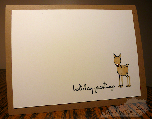
Christmas Card 2012 - Red Nose Knows!


These are my "bulk" Christmas cards this year.  I know "Shock" "Horror" "Gasp" "How can you"?  I have my reasons.  Even when I used to buy my cards from the shop I didn't like trying to select which card went best to whom.  It just isn't me.  It is far better for my own personal well being this time of year to send almost everyone the same card.  I admire those who don't stress with these small decisions however, that is not me.  So help me celebrate me and let me know what you think.

To be honest I think the process is pretty self evident.  The stamps are Clear dollar dear stamp and the greeting from Kitchen Sink Stamps.  I did test out some combinations before I went with the black sentiment, but it was the most pleasing to my eye on this card. 

It took about 8 hours to complete 104 cards.  I will be honest I thought I was making 100 but somewhere along the line miscounted.  Better to be on the safe side right? LOL!  I cut 26 sheets of white cardstock down into four 5 x 3 3/4 rectangles. I was able to stamp both the sentiment and the deer at one time so I just kept stamping until I got to the bottom of the stack.  Then I took the stack and colored until I got to the bottom of the stack.  As I colored with Copics I made certain to move the card onto a piece of paper to color because of color saturation through the cardstock.  Once those were done, I went through and colored the noses red.  This was more of a safety feature in case the rhinestones came off the card the reindeer would still have a red nose.


At this point I scored and cut down 52 pieces of kraft cardstock for the base.  Once I folded these, I attached the top layer to the base.  Then I glued on red rhinestones.  I will be honest with you, these rhinestones were self adhesive but the adhesive was very flexible and I just didn't feel it was secure enough.  I did a test run with some Martha Stewart glitter adhesive and boy does that stick! So I used it on all the cards to adhere the rhinestones.

My next worry was the post office machinery destroying them.  So I decided to line my envelopes with cardstock.  Because it is best if the cardstock is texture I just went for it and sent all this through a wintery embossing folder before I adhered it to the inside of the envelope.

Once the envelopes were complete I set out to make my inserts for the cards I will send out and stamped the backs.  I won't go into trying to sort out my printer/computer- ok my brain so that it all looked right!

The other thing I do is try to hand address the cards.  I have had bad experiences in the past with using labels and they don't get delivered because it is assumed they must be from businesses etc.  So hand address I do.

Ingredients
Card Size - 5.5 x 4.25 inches (13.97 cm x 10.79 cm)
Cardstock - Neenah Classic Crest Solar White Smooth, Recollections Kraft, Georgia Pacific white cardstock
Stamps - Clear Dollar Stamps - deer, Kitchen Sink Stamps
Ink - Memento
Color - Copic, Sakura Red Stardust gel pen
Accessories - 3mm red rhinestone, Embossing folder


Friday, December 14, 2012

Christmas window...


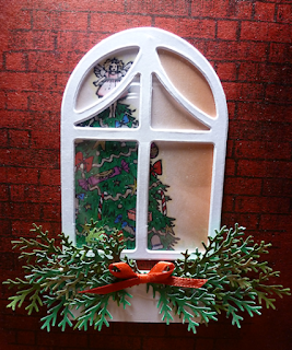
So my wonderful husband looks at me when I show him this card for his mother and says "Don't take this the wrong way" uh oh... now what I'm thinking "But" ok here it comes "that looks professional" What! Huh! I guess he wanted to ensure his "Husband of the Year Award" was still intact! - Now don't get me wrong I can totallly see how someone could take that the wrong way but I didn't.  I'm so pleased that I am still grinning ear to ear!  And I also know it means it is something he would have picked out for his mother so double win!
 
First things first this is a CASE of all those fantastic Madison Window dies... oh how I have pined for one.  However, I remembered that I had these die cuts going unloved in my stash so no die buying for me!  It is also specifically inspired by this card in the SCS gallery. Just how beautifully elegant is that card.

I had to make changes as I don't have that die, embossing folder, or stamps.  I hope you like what I have done.

I stamped the tree on a bit of cardstock and colored it in.  If you look carefully it is a very "British" tree with crackers and a fairy on top.  There is lots of bling and sparkle on there too with my Sakura stardust and metallic pens.  The whole scene is colored with copics.

I then placed my window die over the tree to get the best fit and cut the tree scene to window size.  I then cut some acetate packaging down to be the window panes.  When placing it on the scene I didn't like it directly on the scene so I used another window die cut to create depth and then adhered it all together.

As this was drying, I worked on the background.  I created a mask so the stamp wouldn't leave sharp edges and then stamped it in the middle of some red card stock.  The red was really too red so I knocked back that color with some copic reds and greys that I airbrushed on to get the effect I wanted.
After I placed the window on the scene, I wanted the foliage to come out of a window box so I just hand cut and layered a few bits of scrap cardstock using an edge from where I had cut a die to give some interest to the very top layer.  I punched a variety of green branches and then adhered them to the box.  To finish this off I tied a small red bow and a stardust pen to give the greenery sparkle.
I generated the sentiment on my computer.
 
Ingredients
Card Size - 8.5 in x 5.5 in
Cardstock - Neenah Classic Crest Solar White Smooth, Recollections red,
Stamps - tree unknown bought in England, Bricks - Cornish Heritage Farms
Ink - Memento
Color - Copics, Sakura stardust and metallic pens
Accessories - Window diecut (unknown), Acetate packaging, Martha Stewart branch punch


Thursday, December 13, 2012

Tilt - a Ho Ho Ho!


This card looks simple right... well let me tell you.... it took forever to make!

Now a single tilt probably wouldn't have taken so long but I needed these to line up and then I needed them to be bottom heavy to actually tilt so that required and extra weight on the bottom of each "Ho" to help it swing.

The "HO"'s are a Justrite alphabet that I stamped in versamark, embossed with zing glitter embossing powder.  They really do sparkle.  Like my Christmas Cod Card I stamped 3 hats on a sheet of red scrap and cut them out and applied liquid applique which I heated to puff up.  These were mounted together on a diecut green circle. 

The front panel was run through my Grand Caliber twice to cover the card.  This type of situation is exactly what I bought it for - when I want to emboss the entire front of a card and the embossing is at 90degrees from the panel and needs a larger platform.  Luckily I didn't get rid of my cuttlebug.  I use it most for smaller things, however it is great to still have those plates to run my embossing folders through my Grand Caliber without messing about with shims.

Ingredients
Card Size - 8.5 in x 5.5 in
Cardstock - Neenah Classic Crest Solar White Smooth, Bazzill
Stamps - Justrite Stampers, High Hopes Stamps (santa hat off a santa image)
Ink - Memento, Versamark
Accessories - Zing green glitter embossing powder, Liquid Applique, 9 pennies, Spellbinders circle dies.


just wanted to show off the texture and dimension on this card in this last picture.


Wednesday, December 12, 2012

The stockings were hung


This is for my nephew and his girlfriend, they have recently set up house together so I thought I would acknowledge that with their 1st Christmas card together from us.

I will be honest.  I'm not happy with this.  Maybe it needed more white space or solid color.

What I do like is the velvety texture of the stockings/and the dark green sections on the DP.

The stockings are die cut.  I die cut the tops of the stockings and then split the paper to get the soft, fabric texture. 

Ingredients
Card Stock - Neenah Classic Crest, Solar White, SEI velvet paper, Bazzill, Me & My Big Ideas
Color - Sakura metallic gold pen
Dies - Quickutz stocking dies, Spellbinders circles.

Tuesday, December 11, 2012

Christmas Cod


Does anyone else have trouble making special cards for those in your life that you haven't seen in forever?  I guess you don't if you don't make them for specific people.  I know that I am out on a limb in that way because I try to make a card to someone's interest.  I can categorically say that this isn't Zoe's interest.  But I went with punny!  Zoe has a cracking sense of humour and I am hopeful she will like this card.  And yes, I know I have basically done a variation of this card as a Birthday Cod but that is why I got these stamps to do punny, fun cards.

So basically this is all stamping, copic coloring, airbrushing for the scene.  The cod I stamped on a scrap and colored him in then cut him out.  I then covered him all over in glitter glue. This serves two purposes, it makes him blingy AND scaley which is pretty much the ultimate in being the coolest fish ever on a card!  I printed out the speech bubble on my printer.  The santa hat is actually off a santa hat I have.  That was stamped directly on red card and liquid applique was applied and heated.

I hope she likes it.
 
Ingredients
Card Size - 8.5 in x 5.5 in
Cardstock - Neenah Classic Crest Solar White smooth, red scrap unknown
Stamps - High Hopes Stamps
Ink - Memento
Color - Copics
Accessories - Glitter Glue, Liquid Applique.
 

Monday, December 10, 2012

70th Birthday Magic Box


Well as I have a bazillion pictures with this post I can tell you the unabridged version of this project/card. (scroll to bottom of post if you want to skip the verbage and just see the finished project).

Up until the very last minute I really didn't know what I was going to do.  You see this had to be special as it was for my mother's 70th birthday and I am pretty much all that she has.  Now don't get me wrong, she has a great life, my husband, grandkids, brother's, sisters, neices, nephews, friends etc.  But I'm it as far as immediate/next of kin family.

Then it struck me, that I could revisit the magic box and a few other improvements from the one I made in February.

So an idea was born and I went to the Magic Box  blog and studied to decide what I could and was able to do to make this box special and unique.  I know it isn't a patch on what is achieved on that blog site, but it is a decent try!  One thing I did decide is that black is the perfect base for the box I wanted to make because they really pop with the contrast.


I actually make mine larger than the instructions on the blog, so I had to work out the math for the top.  It is a 12x12 sheet scored at 4 and 8 inches in both direction and the corners cut out.  The top I wanted 1 1/4 drops on the sides of the lid and I guessed at a 4 1/4 base.  TBH that was too big - it works but I would have preferred it more snug.  I basically cut a 1 1/4 + 1 1/4 + 4 1/4 = 6 3/4 square and then scored in from each side at 1 1/4.  I cut up to the score mark from two sides and used the tabs to adhere to the adjoining drop to make the lid.

I decided to keep it pretty monotone on the outside and put the zing on the inside.  I decide primarily on pinks and then greens came naturally as the leaves and the pop color to keep it tied all together. 

After I picked the colors I went through my prima stash and found complimentary pinks, whites and greens and found out my rhinestones because this really had to be over the top pretty.

I then moved on to create the cake. I had decided to use a battery candle in the middle having seen these in the Splitcoast Stampers Gallery.  But I had to up the ante and make a two layer cake! So now I had to work out how to turn the cake on and off.  I decided that the cake had to be removable from the card but stable when in the card.  So I made a mount of sorts by basically making another cake beneath the cake using circle dies, fringing the edges to bend down and using cardstock to create the height.  I know I'm not explaining it well.  I guess I need to make a tutorial.  But trust me when I say it involved a lot of die cutting and then embossing to get an even circle within the circle to fringe down to adhere to the sides.

I stamped the sides with Stampendous candle stamp and colored with coordinating copics  and glitter glue for the flames for that extra bit of sparkle.  I glued the candle to the bottom of the top of the cake and then glued the fringe to the stamped sides which I had eased into a curved shape by pre-rolling. I used a covered paperclip to hold everything together whilst it adhered.

For the next layer I had to die cut an access hole in the middle of the circle layer to turn the candle on and off and adhere it to the upper level with fringing.  That layer was also cut and fringed to adhere the stamped sides.  Again this was held in place with a paper clip until it was secure.  There is the third circle layer that can't be seen is adhered similarly to the sides and to be honest is fiddly but it is what makes everything so secure.  I then put another layer of cardstock inside at the same height to sandwich the fringe and reinforce the height to withstand the weight of the candle.

I then took inspiration from the plethora of cake decorating shows on the television and from the magnificent Cake Wrecks blog and put bling and flowers on my cake.  I cut down green primas to make leaves and then adhered the pink flowers to each layer.  After these were set I went back and adhered a tiny rhinestone 3mm to each center - gotta have that bling!  I really wanted this card to sparkle in the low light of November. Gotta say that it seemed to take forever to adhere those rhinestones! Hopefully, it was worth it.

With the cake layer completed, I decided to use pink as the base for the green on the inside and double pink on the outside.  I embossed the outside layers with a Happy Birthday folder and the inside layers with Floral Fantasy, making one of the layers into pocket. 

I knew I wanted to use the magic part of the boxes for me which is the seemingly flying elements.  I chose two; an owl (which my mother loves) and a chalkboard (retired school teacher).  I tried a few more for the other flap but it just started looking too random.  So I stamped and colored my owl and chalkboard x 2 and sandwiched some clear packaging that I had cut into strips between the stamped pieces.  These strips were then attached to the side panels and prima flowers (with rhinestones) were artistically arranged to cover the base and also on the front and back panels.

The final touch was to place some ribbon around the drop on the lid to finish it off and to create a bow for the top of the box. 

Ingredients
Box size 4 x 4 x 4 - lid 4 1/4 x 1 1/4
Cardstock - The Paper Studio, Recollections, Neenah Classic Crest Solar White Smooth
Stamps - Clear Dollar Stamps (Owl), Stampendous (candles, chalkboard)
Ink - Memento
Color - Copics
Accessories - Prima Flowers, Rhinestones, Battery tea light, Embossing Folders - Floral Fantasy, Happy Birthday, Ribbon, Googly eyes, Glitter Glue, Sakura Souffle pen, Acetate, Spellbinders circle dies.

Keep scrolling down to see the finished project!


Sunday, December 9, 2012

High Flying 16th Birthday!


I made this card for my cousin on his 16th birthday.  I forgot that I actually used this stamp on his card a couple of years ago.  Must try harder next year!  I freehand drew the curve for the flight and cut it out.  The rest is stamping, spinner card instruction from Splitcoast Stampers, coloring in and airbrushing for that soft sky effect.

Ingredients
Card Size 8.5 in x 5.5 in
Cardstock - Neenah Solar White Classic Crest Smooth
Stamps - Clear Dollar Stamps (airplane), Kitchen Sink Stamps
Ink - Memento
Color - Copics

Friday, December 7, 2012

From a Bunch of Nuts


This card was for my nephew's girlfriend.  I have yet to meet her - the disadvantages of living on different continents, however, I thought this was appropriately young and disparaging (on the inside it says from a bunch of nuts).  So hopefully she liked it and got a laugh.
 
I will be honest I like all the combinations but I think the image is too small for this size card.  It is hard at times to be a "Big Card" giver and love these cute little images.  I'm sure I will eventually work it out.

Ingredients-
Card Size - 8.5 in x 5.5 in
Cardstock - Recollections Kraft, Neenah Solar White Classic Crest, The Paper Studio
Stamps - Clear Dollar Stamps
Ink - Memento
Color - Copics
Accessories - Ribbon from a variety of sources, Spellbinders dies, Airbrush, and googly eyes! 


Thursday, December 6, 2012

Birthday Flowers


This is a digital stamp from Clearly iStamp . It was a freebie a few months ago for a competition that I downloaded it for and never entered. So when I was in a bind this week for a large flower stamp and really couldn't think of something productive to make this is what jumped off my computer and said color me!
 
Originally I was going very plain with just the basket of flowers on the background.  TBH it just didn't look right.  I then thought I would add some color to the background to focus the eye.  That looked worse.  So I went through my hoard lovingly procured stash of designer paper and thought this was a decent match and kept the card light and fun.

Do you think it worked?

This card went to our 81 year old auntie with failing eyesight.  It was really important to use a large vibrant image.

This was the first time I had used a digi stamp.  I'm in love!

Ingredients
Card Size 8.5in x 5.5 in 
Cardstock - Neenah Solar White Classic Crest Smooth, The Paper Studio
Stamps - Clearly iStamp, Kitchen Sink Stamps
Ink - Memento Tuxedo Black
Color- Copics
Accessories - clear glitter glue.


Tuesday, November 13, 2012

Just a not so quick note

 
Sometimes I just don't know what to do with myself... and other times I play.  I had this idea that kraft and white are the ultimate combination that aren't nearly exploited enough and can be masculine, fresh, yada, more, etc... well you get the idea. Hmmm... So I set off and stamp my phrase, staggering it to make a background strip, not perfect but I can work with it.  I then wanted to mount the image on white.  Yikes! It really didn't work the way I thought it would. Second thought! Can I save it.  I dry embossed it to make it look like it was intentional.  ugggg.... I'm really not sure.  So I inked the edges to help it.  No, this really isn't working (although I'm sure I will use it).


I then decide maybe it is pink and kraft the ultimate combination that aren't nearly exploited enough and who cares if it masculine but it will be fresh, yada, more, etc... well you get the idea.  So I stamp a light memento pink (do you really expect me to remember the color) oooo I love it.  I go ahead and stamp one phrase in the deeper pink and stamp my 3 step quill and ink. I might just go straight to nirvana at this point... then it dries! OH MY where did my beautiful light pink background go?  I don't believe this! *shaking my head*...
 
 
Third time is charm right? So I decide that grey, pink and kraft the ultimate combination that aren't nearly exploited enough and may not be masculine, but it is fresh, yada, more, etc... well you get the idea by this point don't you? because to be honest I'm not certain I do.  This is absolutely going to work. Um, um, um, it is ok.  but that's about it... maybe it is the placement of the quill that is still off...  Well I have had plenty of practice now.

 
I think it is time to stop counting and just be full of belief that grey, black and kraft are  the ultimate combination that aren't nearly exploited enough and are masculine, fresh, yada, more, etc... well you get the idea. Hmm... that quill and ink.  I need it because without it the card is just a card with words on the front.  I want it.  I'm stubborn, this has to work somehow doesn't it?
 
 
So have I told you about the card I made with kraft, black, grey and white ink? The ultimate combination that aren't nearly exploited enough and can be masculine, fresh, yada, more, etc... I'm still not certain about it.  I will let you know if I ever work it out.
 
Ingredients
Card size - 4.5 x 5.5 inches
Cardstock - Recollections Kraft
Stamps - Kitchen Sink Stamps "3 step school days"
Ink -  Brilliance, Memento - desert sand, potter's clay, angel pink, rose bud, london fog, Tuxedo black.

Saturday, October 6, 2012

Superstar Birthday Soccer Owl

Sometimes the simplest cards are the more complex to make to keep them looking simple.  That made sense right?

I made this card for our dear friend who is a Sheffield Wednesday supporter and a "SuperStar!"


I knew I wanted depth and clean lines for this card and something different from the football (soccer) shirts I have done for him in the past.  So I started thinking about our nickname for him and knew I need to use my star dies and a great image but what image?  I was racking my brain for days.  Sometimes this really is a slow process and then I thought "oh I will just put a football/or owl in the middle and be done with it" Then I remembered this little guy that I had from a Hero Arts set and thought it would be fun to perch him on a football (soccer ball).

I die cut the stars and stamped the image through the back star for placement on the inside of the card.  I then opened up the card and colored the owl with copics and shaded the ball. 

On the top star I stamped the "Super!" in Memento danube blue twice to get the intensity and then used Memento markers to accentuate the different layers of the stars and tie in the colors.


The top layer was adhered to fun foam to create more dimension for the card and googly eyes were adhered to the owl, which to be honest gave the owl a completely different look to the stamp .

I used one of the die cuts on the back of the card to cover the bleed through from the Copics and to sign my name as maker.  This added an extra shadow effect that I couldn't capture on the camera.

Ingredients
Card Size - 8.5in x 5.5 in
Card Stock - Neenah Classic Crest Solar White Smooth
Stamps  - Hero Arts You Hoo Owls; Kitchen Sink Stamps Never A Loss 4 Words; Recollections Comic Talk 

Ink - Memento Tuxedo Black, Danube Blue
Color - Copics

Accessories - Spellbinders Nestabilities Stars, Googly eyes.


Friday, October 5, 2012

Soccer Pride Birthday


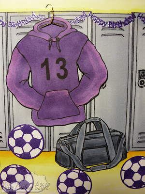
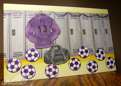
My youngest plays for the school's soccer team so I thought this would be an appropriate card for him.

I stamped the hoodie, bag and soccer balls separately on Neenah Classic Crest.  The balls were stamped with Versamark and heat embossed with metallic purple embossing powder.  I probably should have done some shading on the balls.  The hoodie and bag were stamped with memento ink and colored with copics.  I then hand cut them out and set them aside whilst I stamped the background of lockers.  I didn't worry whether they were all perfectly lined up because I don't know about you but the last time I was in a school the lockers looked like the students were using them and not that worried whether they were lined up. Now don't get me wrong they were bolted down and were lined up but I felt the lack of perfection in lining them up added to the ambience of the background.  Well, that is my story and I am sticking to it! ;)  I colored them in copics, keeping them neutral and colored the wall and floor in school colors.  TBH if I think about it I have probably reversed the actual colors; oh well. 
 
Then I used a Stampendous sentiment stamp and curved it on my acrylic block to make it look like the bunting you buy and hang up.  I stamped that with the Versamark and heat embossed.
When I went to assemble the card the hoodie looked random in the setting so I thought the best way to deal with it was to make a hanger as if it hanging off the lockers.  I got out some wire from my stash and made a couple of holes for the hanger to go through to help it look more realistic. 
Ingredients
Card Size - 8.5 x 5.5 inches
Card stock - Neenah Classic Crest Solar White
Stamps - GinaK Designs: Just So Sporty, Sporty Accessories, and School, Sports, Spirit; Stampendous
Ink - Memento Tuxedo Black, Versamark
Color - Copics
Accessories - Zing! Metallic Purple embossing powder, wire.


Thursday, October 4, 2012

Nom! Nom! Nom! Crunchy!

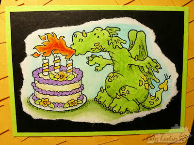
I made this card for my eldest to send to my youngest for his birthday.  He loves Dragons.  On top of that when discussing what our eldest may and may not need for university, I asked if he needed a trunk at which my youngest said - "Does he get an Owl and a wand too"?   Sometimes you really can't make these things up!  Thus I decided he needed a Dragon card from university.

I wanted a lot of texture for the background to imitate dragon scales and I wanted them irregular so handcut every row as randomly as possible.


The image and greeting were stamped on glossy paper and I colored the image in with Copics, adding texture and shading, and then tore around the image and greeting to keep it rustic. The mount for the image and greeting looked better being graphic like the image.

I originally went with putting the mounted image straight on the base and it didn't seem to portray the appropriate amount of fun and whimsy and I just wanted that power of that dragon fire to knock it off kilter, thus I tilted the image on the card.  I think it works and keeps it fun.

BTW the green cardstock as part of the mounting was a happy accident.  I just love the way it replicates the colors from the image, wish I could say I was a genius and planned it that way!

Ingredients
Card size - 8.5 x 5.5 inches
Card stock - Neenah Classic Crest Solar White Smooth, Recollections, Wassau, Hammermill Color Laser Gloss Paper
Stamps - High Hopes Stamps
Ink -  Memento Tuxedo Black
Color - Copics


Wednesday, October 3, 2012

H20 Pink Butterfly

I decided I wanted to try painting my stamp with my Twinkling H20s and then misting them and to stamp.  To be honest it seems to have turned out like a do it yourself Rorshach Test.  This was the best one so I decided to make it into a card. After stamping the butterfly I had to let it dry.  Then I used a circle mask to leave a highlight around the butterfly when I stamped and airbrushed the background. 

I liked the concept of this card but I don't know if I really like how it turned out.  It was fun trying different techniques and keeping it to one layer though.

Sometimes I have difficulty in putting a sentiment on a card, guess I solved that problem for this one!

In the end this was a messy time consuming process and I didn't like the result.  I might try it again with a rubber stamp in the future.  I did toy with the idea of going ahead and stamping the other two steps of the butterfly on top but didn't want to risk the one image I really liked after I had stamped this about a gazillion times (okay that might be a slight exaggeration).  I'm sure I will try it again though probably not this year!

Ingredients
Card Size - 8.5 in x 5.5 in
Cardstock - Neenah Classic Crest Solar White Smooth
Stamps - Kitchen Sink Stamps (3 step butterfly) (Happy Birthday)
Ink - Memento London Fog, Tuxedo Black
Color - Twinkling H20s, Copic for airbrushed background.


Tuesday, October 2, 2012

University Love


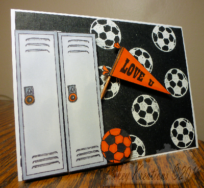
Another challenge card for the GinaK Designs challenges.  I think it was to make a background from a foreground stamp, its been a while and I'm not going to search it out.  It was still a great challenge. 

Lots of dimension with the card.  Love the stick for the pennant (a copic colored toothpick).

Ingredients
Card Size - 4.25 in x 5.5 in
Cardstock - Neenah Classic Crest Solar White Smooth
Stamps - Gina K Designs
Ink - Memento, Versamark
Color - Copics
Accessories - White embossing powder, Dimensional adhesive, Tooth pick.
Monday, October 1, 2012

Pink & White themed Roses


Join in with me, "another GinaKDesigns challenge card" this one was to keep to one color and one neutral.  I really like this card.  From the soft stamped background to the "flick" technique to color the rose.  I don't know if that is what it is called but I used the same technique that I saw used to color hair on YouTube.  I think it works and ads another bit of interest to the coloring of the rose.
Ingredients

Card Size - 8.5 in x 5.5 in
Cardstock - Neenah Classic Crest Solar White Smooth
Stamps - Stampendous, Kitchen Sink Stamps
Ink - Memento
Color - Copics
Accessories - Spellbinders Nestabilities


Sunday, September 30, 2012

Patriotic U Rock

 
Guess you can tell by now I am trying to get my blog back up to date again! LOL! This was another GinaKDesigns Challenge card.  I believe the challenge was patriotic - red, white & blue.  I wanted to do something that was clean and simple and dimensional.  I love the lines of this card and who doesn't enjoy being told they rock!

I took the second picture to show the dimension on this card.  Sometimes I love really complicated cards and other times I like understated.  I like how simple this looks but it takes all the individual components such as layering the star and giving dimension to the hood and pocket of the hoodie that just give it that extra bit of specialness.

Ingredients
Card Size - 4.25 in x 5.5 in
Cardstock - Neenah Classic Crest Solar White Smooth, Archiver's open stock
Stamps - GinaK Designs
Ink - Memento, Versamark
Accessories - Spellbinders star dies, White embossing powder


Saturday, September 29, 2012

Primary Birthday

Yet another challenge card from July from Gina K Designs challenges.  If I remember this one correctly, it was to use primary colors.  I think I mastered that! LOL!  I like it but I don't love it.  I hope I work out what I don't love about it, because I liked the concept.

Ingredients
Card Size -  5.5in x 8.5 in
Cardstock - Neenah Classic Crest Solar White Smooth
Stamps - The Pink Cat Studio, Kitchen Sink Stamps
Ink - Memento
Color - Copics 

Friday, September 28, 2012

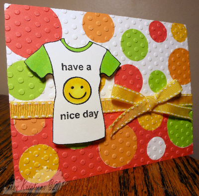
ROY G Have a Nice Day!

 
Another card for another GinaK Designs challenge.  Such a great site and great challenges.  Yeah, the challenge is a couple of months old and we needed to use Red, Orange, Yellow and Green for the challenge.  This just screamed bright and cheerful to me.
 
Just going through my cards, I was thinking, oh I can send that to my son and then I looked at it again and it is quite feminine.  Hopefully I will find a use for it!
 
Ingredients
Card Size - 4.25 in x 5.5 in
Cardstock - Neenah Classic Crest Solar White Smooth, The Paper Studio
Stamps - GinaK Designs
Ink - Memento
Color - Copics
Accessories - ribbon from stock, Spellbinders circle dies, Polka Dot embossign folder


Thursday, September 27, 2012

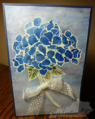
Hydrangea H2O

 
I stamped this for a challenge on GinaKDesigns a while ago to use white embossing powder.  I wanted to make this soft card.  I used Twinkling H20s for the flower and background.  The problem I find with the Twinkling H20s is when to stop.  I'm sure I will get more comfortable with them.  Love the soft, muted but sparkly outcome.
 
Ingredients
Stampendous - Hydrangea
Cardstock - Neenah Classic Crest, Bazzill
Ink - Versamark
Twinkling H20s - Fern, Forest Green, Blue Ice, Ocean Wave, Tanzanite
Accessories - White embossing powder, Ribbon.

Wednesday, September 26, 2012

Yar Har Birthday!

Now if I had been clever I would have had this show up on my blog on talk like a pirate day, so I can cross being clever off my list of things achieved, because I'm just thinking it isn't going to happen now!

For some unknown reason my DH calls me a pirate.  I honestly do not know why.  At the moment it has stuck along with many pirate related punchlines about walking the plank/plundering booty etc.

Now I couldn't really let him get away with that could I?  Here is what I came up with -

 
The process was pretty straightforward.  I stamped my map and colored it in and airbrushed the edges to make it look more pirate-y.  The greeting I printed with a downloadable font and tore it and airbrushed it.  The duck I played with some new to me Hammermill glossy paper.  I don't know how I feel about the paper yet.  I like how it didn't absorb the ink but there is definitely a learning curve if I continue to use it.  It does, however, seem to make my copic brighter if that is possible.
 
Ingredients
Card size - 5.5 in x 8.5 in
Cardstock - Neenah Classic Crest Solar White Smooth, The Paper Studio, Hammermill Color Laser Gloss Paper, Printer Paper,
Stamps - Viva Las Vegastamps
Ink - Memento
Color - Copics


Tuesday, September 25, 2012

Sensei's Birthday


Here we go again with my spinner cards.  I made this card for our Sensei.  He has a quite stressful job as well and I thought this would be a bit of light relief for him to see a comical image of himself spinning back and forth on a card.  He loved it and couldn't put it down.
 
Ingredients
Card size - 8.5 in x 5.5 in
Cardstock - Neenah Class Crest Solar White Smooth, The Paper Studio
Stamps - Stampabilities, Stampendous
Ink - Memento
Color - Copics